Sample review

A complete website review, start to finish

Riverbend Chapel is a fictional church. We built a small website for it with problems we often see on real church sites, then reviewed it the way we review a client's site. This page is what you would receive.

What we reviewed

Scope agreed before the review: three pages and the five tasks that matter most to visitors and members.

Pages
Home, Plan a Visit, and Kids Week Registration.
Tasks
Find service times and the location. Plan a first visit with children. Register a child for Kids Week. Give online. Watch the latest sermon.
Methods
An automatic checking tool first, then each task worked through by hand: on a computer, on a phone-sized screen, without a mouse, and checking what the page tells screen readers. Measured against the accessibility standard websites are held to (WCAG 2.2 AA).

Summary

  • 11findings
  • 7high priority
  • 2caught by the automatic check

A first-time visitor on a phone cannot easily find when services are, and someone who relies on a screen reader (software that reads the page aloud) cannot find them at all. Registering a child is the hardest task on the site: the form erases everything after any mistake and never says which field was wrong.

The automatic checking tool caught two of the eleven findings. The other nine, including every finding about using the site without a mouse and the registration form, came from a person working through each task, trying the site at phone size, and checking what a screen reader would say.

Findings

Ordered by priority. Each finding names the issue, its effect on people, the evidence, how we found it, and a recommended next step.

  1. Finding 1, High priority

    Service times and address appear only inside the banner image

    Effect on people
    A screen reader announces the banner as "Welcome image" and never gives the times or address. On a phone the image shrinks, and the white text over a pale background becomes hard for anyone to read.
    Evidence
    Home page, top banner. The times and address are not in the page text. The white banner text on a pale background is well below the readability standard for contrast.
    How we found it
    By hand, checking what a screen reader would say on the page. The automatic check passed the image because it has a description, even though the description says nothing useful.
    Recommended next step
    Put the service times and address in text near the top of the page, with the address linking to a map. If the banner is then only decoration, mark it as decorative so screen readers skip it.
    Likely owner
    Whoever edits home page content.
    Standard
    WCAG 1.1.1 Non-text Content, 1.4.3 Contrast (Minimum)
  2. Finding 2, High priority

    The registration form erases everything after any mistake

    Effect on people
    A parent who types the phone number with spaces instead of dashes loses every answer and has to start over. The message does not say which field was wrong, so the same mistake is likely to happen again. Screen reader users are not told the message appeared.
    Evidence
    Kids Week Registration. We filled every field correctly except the phone number (555 123 4567), then submitted. All fields emptied, focus stayed on Submit, and the only message was "There was an error with your submission."
    How we found it
    By hand, filling out the form. Automatic checking tools don't fill out forms.
    Recommended next step
    Keep what people typed. Accept common phone formats. Show a specific message beside each field that needs attention, and announce a summary when the form is submitted.
    Likely owner
    Website provider or developer; some form builders offer these settings.
    Standard
    WCAG 3.3.1 Error Identification, 3.3.3 Error Suggestion, 4.1.3 Status Messages
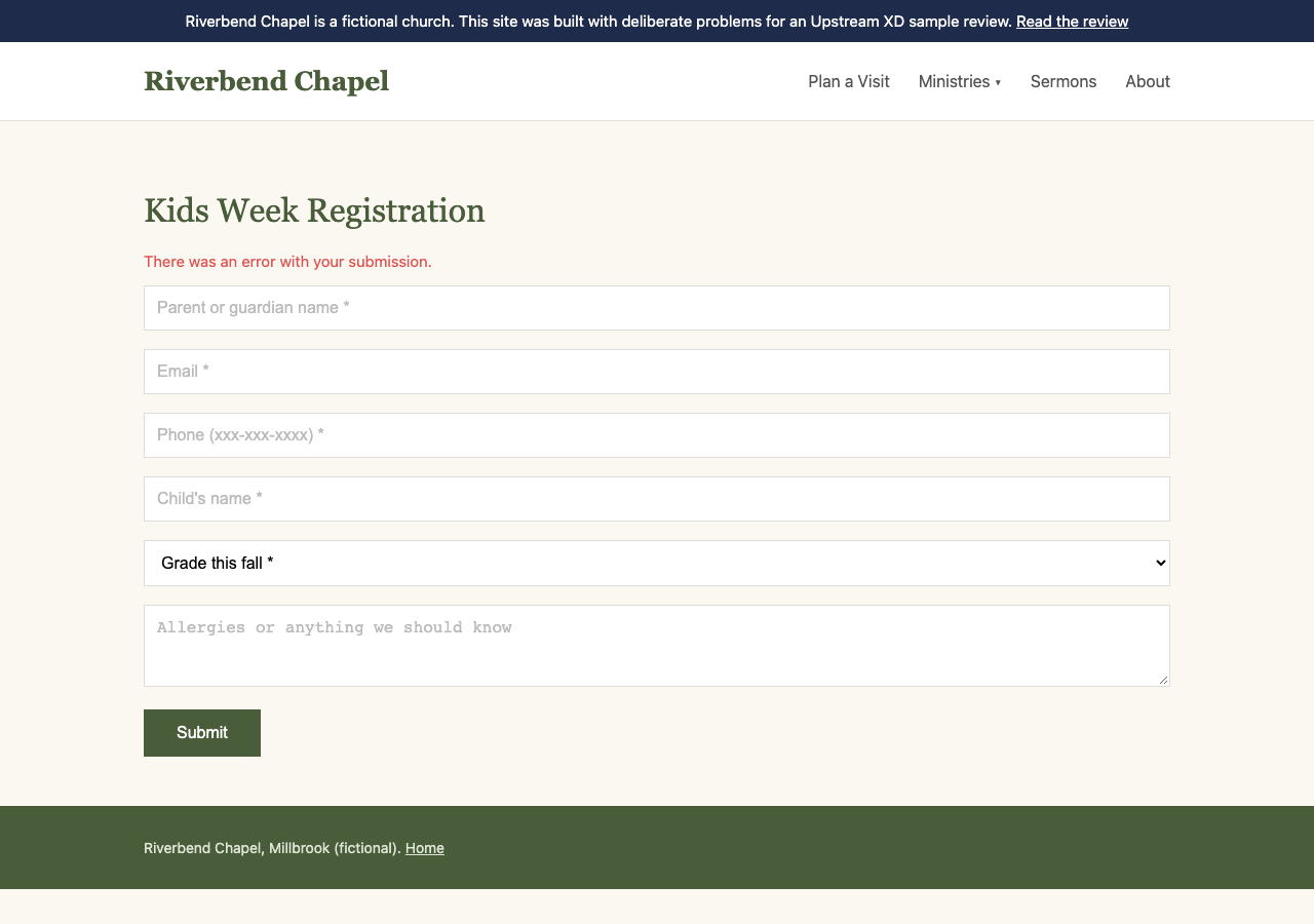
    The registration form after submitting: every field is empty again, and a red line above the form says There was an error with your submission.
    Registration after one mistake: the answers are gone, and the message does not say what went wrong.
  3. Finding 3, High priority

    Form fields lose their labels as soon as you type

    Effect on people
    Each field's only label is faint gray text inside the box, and it disappears as soon as someone starts typing. That makes it easy to lose track, especially for people with memory or attention difficulties. The grade menu has no name at all, so a screen reader can't say what it's for.
    Evidence
    Kids Week Registration, all six fields. The gray hint text is far too light to meet the readability standard.
    How we found it
    Both. The automatic check caught the unnamed grade menu. It missed the disappearing labels, which we found by hand.
    Recommended next step
    Give every field a visible label above it, and mark required fields in the label.
    Likely owner
    Website provider or developer.
    Standard
    WCAG 1.3.1 Info and Relationships, 3.3.2 Labels or Instructions, 4.1.2 Name, Role, Value
  4. Finding 4, High priority

    Keyboard users cannot see where they are

    Effect on people
    People who get around a website without a mouse, using the keyboard or another device, lose their place on every page, because nothing shows which link or field they're on.
    Evidence
    All three pages. Pressing Tab moved from link to link with nothing on screen to show where we were. The site's design settings hide that marker everywhere.
    How we found it
    By hand, moving through each page with the Tab key instead of a mouse.
    Recommended next step
    Turn the marker back on, and make it bold and easy to see on every background.
    Likely owner
    Website provider or developer; often a theme setting.
    Standard
    WCAG 2.4.7 Focus Visible
  5. Finding 5, High priority

    The Ministries menu opens only with a mouse

    Effect on people
    Keyboard users skip straight past Ministries. Students and Small Groups cannot be reached at all without a mouse.
    Evidence
    The main menu on every page. Moving through it with the Tab key went from Plan a Visit straight to Sermons; Ministries never opened.
    How we found it
    By hand, moving through the menu with the Tab key.
    Recommended next step
    Make Ministries a button that opens the menu with Enter or Space, or link it to a Ministries page that lists each one.
    Likely owner
    Website provider or developer.
    Standard
    WCAG 2.1.1 Keyboard
  6. Finding 6, High priority

    Give Online looks like a button but is not one

    Effect on people
    People who don't use a mouse cannot reach it, and a screen reader reads it as plain words, so nothing says it can be clicked.
    Evidence
    Home page, Give section. Moving through the page with the Tab key skipped it, and a screen reader treats it as ordinary text, not a button.
    How we found it
    By hand, with the Tab key and by checking what a screen reader would say.
    Recommended next step
    Make Give Online a real link to the giving page.
    Likely owner
    Whoever edits home page content, if the site builder offers a button block; otherwise the website provider.
    Standard
    WCAG 2.1.1 Keyboard, 4.1.2 Name, Role, Value
  7. Finding 7, High priority

    Pages do not fit a phone screen

    Effect on people
    On a narrow phone, or with text enlarged, people scroll sideways to read every line, and parts of the navigation fall off screen.
    Evidence
    All three pages. On a small phone, each page is more than three times wider than the screen, because the layout is set to one fixed width.
    How we found it
    An automatic measurement at phone size, then checked by hand.
    Recommended next step
    Let the layout shrink to the screen, with cards stacking on narrow screens.
    Likely owner
    Website provider or developer; often fixed by a responsive theme.
    Standard
    WCAG 1.4.10 Reflow
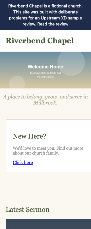
    The Riverbend Chapel home page on a 320 pixel wide screen. Only the church name shows in the header because the navigation links are off screen to the right, the service times in the banner are tiny, and the New Here card runs past the right edge.
    Home page at phone width: the page is wider than the screen.
  8. Finding 8, Medium priority

    Some text is too light to read comfortably

    Effect on people
    People with low vision, older eyes, or a phone in sunlight struggle to read the tagline and the card descriptions.
    Evidence
    Home page. The tagline and the card descriptions are light gray on a light background, well below the readability standard for contrast.
    How we found it
    The automatic check, confirmed by hand.
    Recommended next step
    Darken both text colors until they meet the standard.
    Likely owner
    Website provider, or whoever manages the theme's colors.
    Standard
    WCAG 1.4.3 Contrast (Minimum)
  9. Finding 9, Medium priority

    Three links all say Click here

    Effect on people
    Screen reader users often move through a page by its list of links. Three identical links that go to different places give no clue where each one leads.
    Evidence
    Home page, the New Here?, Kids Week, and Bulletin cards. The Bulletin link also goes nowhere.
    How we found it
    By hand, checking what a screen reader would say on the page.
    Recommended next step
    Name each link for where it goes, such as Plan your first visit and Register for Kids Week, and fix or remove the Bulletin link.
    Likely owner
    Whoever edits home page content.
    Standard
    WCAG 2.4.4 Link Purpose (In Context)
  10. Finding 10, Medium priority

    The sermon video offers no captions

    Effect on people
    People who are deaf or hard of hearing cannot follow the sermon, and neither can anyone watching with the sound off.
    Evidence
    Home page, Latest Sermon. The player has no captions track.
    How we found it
    By hand. The automatic check missed it.
    Recommended next step
    Add captions to each new sermon. Most video hosts generate a draft that someone can correct before publishing.
    Likely owner
    Whoever uploads sermons each week.
    Standard
    WCAG 1.2.2 Captions (Prerecorded)
  11. Finding 11, Medium priority

    Plan a Visit buries what first-time visitors need

    Effect on people
    A parent planning a first visit has to read the church's history and worship style before learning what happens with their children, and where to park comes last.
    Evidence
    Plan a Visit is five paragraphs with no headings. Children's check-in is in the fourth paragraph; parking and the entrance are in the fifth. Service times are not on the page.
    How we found it
    By hand, working through the task of planning a first visit with children.
    Recommended next step
    Lead with service times, address, and parking. Add headings for What to expect, Kids, and Getting here, and move the church's story lower.
    Likely owner
    Whoever edits page content.
    Standard
    Usability; WCAG 2.4.6 Headings and Labels

What to fix first

This week, in content
Put service times and the address in text on the home page, rename the Click here links, and restructure Plan a Visit. These need no developer on most platforms.
Next, with your website provider
Fix the registration form, add labels above each field, turn back on the marker that shows where you are, make the menu and Give Online work without a mouse, and let the layout fit phones. Several may be simple settings in the website's design.
Ongoing
Caption each new sermon, and check text colors when the design changes.

What this review did not cover

  • Pages and tasks outside the agreed scope, such as the giving page itself and the events calendar.
  • Research with people who use the site. An expert review predicts problems; it does not replace hearing from visitors and members.
  • Legal compliance. A review does not certify compliance or guarantee that every barrier has been found.

Want a review like this for your website?

Tell us about your website and what people need to do there. We'll suggest a sensible scope and explain what it would cost.

Let's Talk About Your Website